Glossary · Analysis
The Diagram That Shows Who a Team Actually Plays Through
A pass network plots each player at their average position and links them by how often they pass to each other. Here is how it is built and how to read one.
By 01 Owen
· Updated 19 Sep 2026 · 4 min read
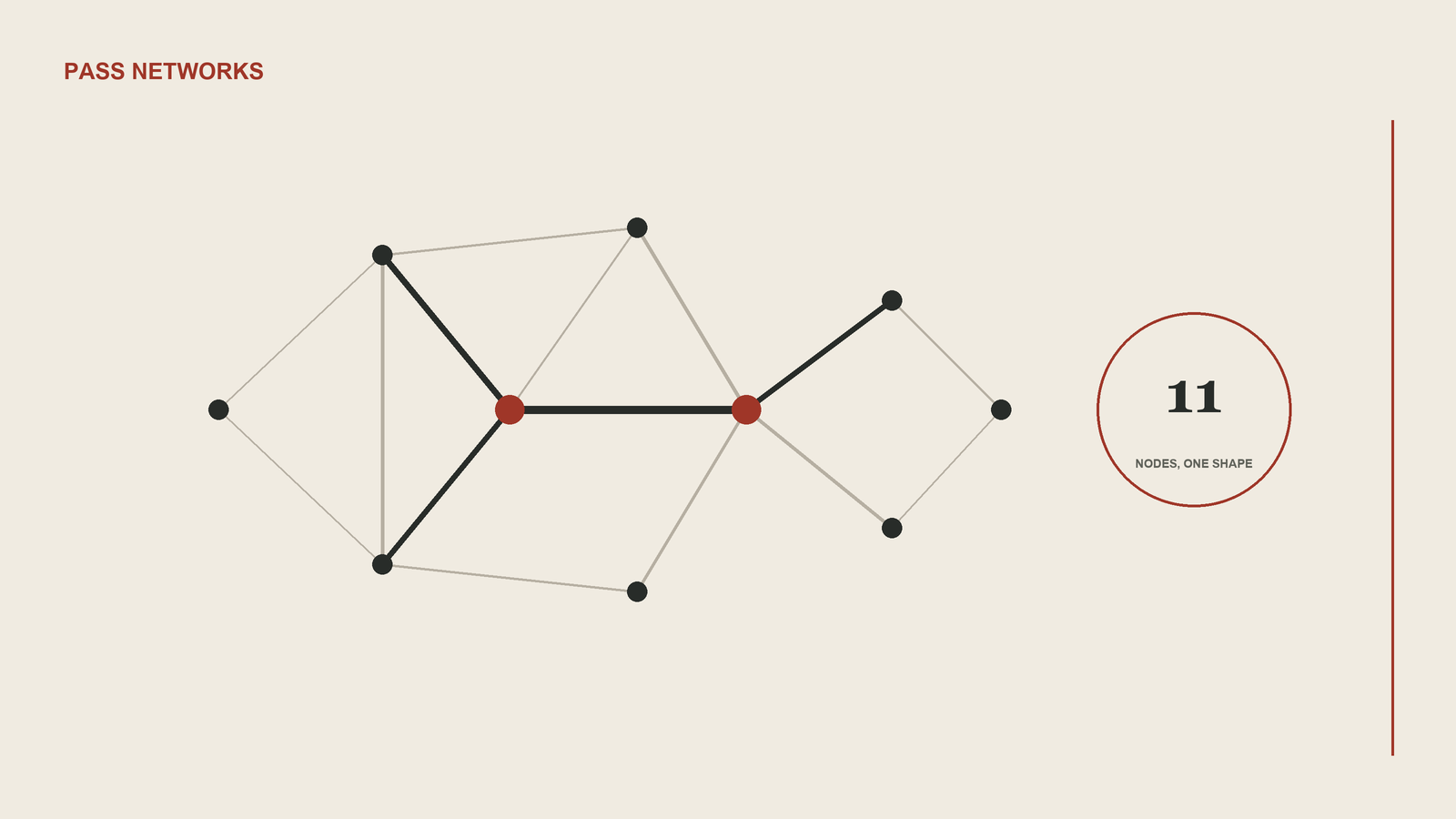
A pass network is a diagram of a team's possession in which each player is a node placed at their average position and each line between two players is drawn thicker the more passes travelled between them. Eleven circles on a pitch, a web of lines between them, and within a few seconds you can see where the ball actually went, which is often not where the team sheet said it would go.
The build is simple. Take every completed pass a team played, note who played it, who received it and where. A player's node sits at the mean location of the passes they played and received. The line between two players is scaled by how many passes ran between them, and most versions of the graphic drop pairs below a small threshold so the picture is not cluttered by one-off exchanges. Node size usually reflects how many passes a player was involved in, though some providers scale it by a threat measure such as expected threat.
Almost every serious version stops counting at the first substitution. A network with twelve or thirteen nodes is a picture of two overlapping teams, and a substitute who played fifteen minutes would sit at an average built on a handful of touches. Cutting at the first change keeps the sample to eleven players who shared the pitch for the same stretch. It also means a network from a match with a tenth-minute injury tells you very little.
What people read from the shape is mostly structure. Thick lines down one flank and thin ones down the other say which side the team built through, whether by design or because the opponent blocked the other route. A node with almost no lines attached is an isolated player, usually a striker the midfield could not find or a winger left waiting for a pass that never came. The player with thick lines in every direction is the pivot, the one everything routed through. Where the full backs sit tells you how high the team pushed. None of this is hidden in the data, but the network makes it legible in a way a table of pass counts does not.
Because the graphic is a network in the mathematical sense, analysts borrow measures from network science. Degree centrality is simply how many connections a node has, which in football means how many teammates a player exchanged passes with. Betweenness centrality asks how often a player sits on the shortest passing route between two other players, which is a reasonable proxy for how much the team depends on them to move the ball from one zone to another. Clustering measures whether a player's teammates also pass to each other. A study of Guardiola's Barcelona published in Scientific Reports in 2019 compared the team's networks with those of its league opponents across a season and found that they differed in clustering, shortest path length and how centrality was distributed across the side. These measures are honest as descriptions of a passing graph. They are weaker as claims about quality, because a team can be highly connected and still be going nowhere.
That is the first of three limits worth holding onto. A pass network counts passes, not value. A short sideways ball between two centre backs and a line-breaking pass that removes four defenders each add one to the same tally, which is exactly the gap that packing and progressive actions were built to close. Some analysts weight lines by threat added, but the standard version does not.
The second limit is the average. A winger who spends half the match hugging the touchline and the other half drifting inside will be plotted somewhere in between, at a spot he never actually stood. A team that changed shape after conceding will produce a single network that describes neither shape properly. Averages hide movement, and football is mostly movement.
The third is direction. A thick line between two players does not tell you which way the ball was going. Ten passes from a number six to a number eight and ten passes back are the same line, and only some tools split it into two arrows. Reading a network as evidence of forward play without checking direction is a common mistake.
Read for what it is, a map of where possession was routed, the pass network is a good first question and a poor final answer. It tells you where to look. It does not tell you what you will find.
How do you read a passing network map?
Start with the positions, not the lines. The node layout is the team's real in-possession shape for the period covered, so compare it with the nominal formation and note where they disagree. Then follow the thickest lines from the goalkeeper and centre backs outwards. That path is the build-up route. Look for a node with very thin or missing connections, which is usually an attacker the team failed to reach, and for the node with the most lines, which is the player the team depended on. Finally check the time window the graphic covers. If it ends at an early substitution, it describes a fragment of the match, not the match.
Sources and further reading
- Explaining xGChain Passing Networks — StatsBomb (accessed 18 Sep 2026)
- A network theory analysis of football strategies — Peña and Touchette, arXiv (accessed 18 Sep 2026)